FMP
(final major project)
Wednesday, 30 May 2012
BOARDS READY TO PRINT
I have colour coded my briefs for on the disc as well:
green = printed
yellow = other briefs not printed
blue = small briefs
Tuesday, 29 May 2012
Updated portfolio,
Updated portfolio,
Some of my files were unable to open due to the software being different to the software in the other studio. I went to the bubble but they said I would have to open it in the right software, which I can't do at the moment.
Unfortunately some of the images aren't good quality but I have the structure and briefs I want to include in it set. I also updated the cover to have my logo on it as opposed to my old, handwritten information.
Thursday, 24 May 2012
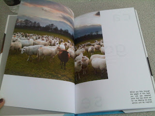
Fashion yearbook proof!!
Few shots of some of the spreads of the yearbook proof
I am very happy with how it has turned out, all of the spreads work together, and the colour has come out strong and as vibrant as possible.
I am very happy with how it has turned out, all of the spreads work together, and the colour has come out strong and as vibrant as possible.
Finalising Roll packaging
This element of the brief wasn't a main aspect, however I wanted to make sure the packaging was understood. Unfortunately I feel the packaging I constructed out of mount board, hasn't turned out neat enough to actually submit. After talking to Fred I am mocking up the packaging on photographs and also creating an artwork that would go on the packaging.
I wanted the design to be quite simple, and also able to be used for the whole year.
I based my design on the template I received when my dc publication arrived. I feel it's appropriate.
I wanted the design to be quite simple, and also able to be used for the whole year.
I based my design on the template I received when my dc publication arrived. I feel it's appropriate.
There will be the roll logo and slogan at the bottom, and then the white box would be a sticker that would be stuck onto the card.
The test in the bottom column specifically states what is in the package, i.e march issue, magazine with poster etc...
bit more decoration on the cover, aiming to infuse a bit of the express/delivery side of it.
Republic pitch
I showed them my idea and they said they liked it and had thought about wanting to use aspects of peoples faces to help communicate the community element of Republic.
I've done a few rough examples of what I had in mind:
I've done a few rough examples of what I had in mind:
I thought about spreading the imagery across the banners that run along the bottom of the building.
Each banner would have an element of a face on it.
I added type, however this could easily be changed.
Also the photos I have used are of celebrities that I used for my Roll brief, so they could be different also.
Subscribe to:
Comments (Atom)


