Showing posts with label DP - Brief 8 - Identity for Music. Show all posts

Monday, 21 May 2012

making the Syntax CD covers,


Once I made the simple CD case, I needed to add the acetate. This was a slight problem when it came to folding the acetate, it was quite tough to fold.


The hard bit was adding the letters, I tried to make them look as straight as possible.


the covers as a set


Friday, 18 May 2012

Putting Syntax into context!


I chose this photo as it's a bit grungey, suits that gig/concert look. I whitened out the original image and then layered over my poster, multiplying it. 

 
I added the reflections onto the poster to make it seem like it was behind the glass.
I want to give the image the feel that it is on o2 academy's building, so in the reflection I've added their logo.


Thursday, 17 May 2012

Syntax - further context

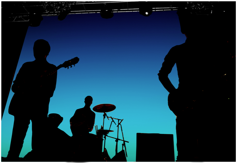
This is the image I have decided to use when portraying my idea for having a glowing backdrop.


cutting around the image...... loong.


I placed the image behind the image, and increased the black levels of it as well. They had a few orange stains left over from the previous glow that came off the image, so I overlaid a black photo filter to discard any unwanted colour. 

I am happy with this as it gives an idea of what I had in my head. I didn't want to have anything else in the back drop as I feel it would take away from the music. The colours speak for themselves, and feature a lot in throughout the gig's merchandise. The colours almost act as the element of branding the gig. 


GLOW STICKS

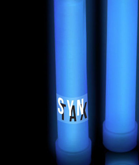
I have decided that glow sticks would be sold at the gig as well, to enhance the colourful and light effect that runs throughout the experience.


I'm trying to create the atmosphere that could be featured in at the event. 


---------------------------------

Should I make them my own???
At the gig, there would be blue glow sticks sold, they wouldn't necessarily have anything on them that was specifically for SYNTAX, but the colour would support the identity for that specific gig. 

I spoke to Lorenzo about whether I can just use an image of a glow stick that I think is appropriate (seeing as all I would do would be order the glow stick and photograph it myself) which takes time I DONT HAVE. 

We agreed that maybe, include some element that signifies it as syntax, similar to what I have proposed with the drinks


Wednesday, 9 May 2012

Syntax - ticket, finalising design + gig merchandise

I looked a few tickets, especially o2 ones. In a way I want to keep to those guidelines, as the design would have to fit to certain restrictions.


I thought that I could use the colour gradient that features throughout the single's tour. In the case I have used, it is for their single 'Pray', which features the blue-green gradient. 


I have used a typeface that is commonly used for o2 tickets. I feel the ticket doesn't have to be, and I don't want it to be thoroughly thought out in terms of design. The gig poster, album covers and interior aspects of the gig will be what is design considered. 

THE GIG. 

Each gig would support a single. 
This gig specialises in the release of the single 'Pray'. 

T SHIRTs for Pray

white on white

Front

Front


Back

black on white

OR

front

back


Friday, 4 May 2012

PREP FOR PRINT


I have readjusted the size of the covers slightly to give me more room when making the package.


I am printing less of stuff just incase it goes wrong or needs to be changed and printed again. 


Final adjustments/design decisions:


Syntax gig poster:


I am printing a black and white version of the poster. 
I have asked people how they read the poster, they said that the background image shouldn't be so harshly covered up, so I have made the type smaller and into the two corners. 


I've added a slight grey to the white poster, to bring it out slightly so it isn't just on white. 


----------------------------------------------------


TP fold out poster adjusted slightly. Making the type smaller in the bottom left. 

------------------------------------------------

Roll fold out posters


added few issue details on the poster, however typeface is small so shouldn't intrude on the poster. 

---------------------------------------------------

Syntax cd covers- 

Improving typeface size and enlarging the kerning on the text at the back. I also made the barcode bigger. 

(too small)


---------------------------------------

TYPEFACE CHANGE FOR TYPOGRAPHIC POETRY.

I have struggled with typeface with this brief, as I wanted to use something quite classic. 
Minion Pro - Goudy Old Style
I like it's crispness but still looks like quite a classic serif.