
I want them to be quite simple, which a focus on the type and it's abstract layout. The covers are colour themed/catagorised, I feel it will be effective to include this in the posters.

Originally I was going to include a poem on the poster, but I feel i looked too much like a repeat of the contents,
However, should some of the poem be included, as well as the large caption:
Including a small extract within a thick border:

extract included within the coloured box:

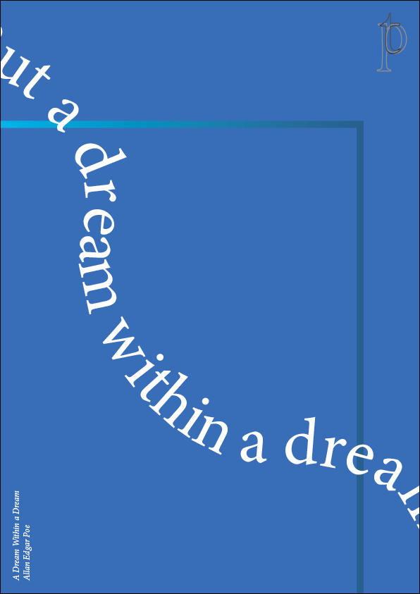
Jumbled poem:

more simple but with layout adjustments:

I wanted to make it look more systematic, but now I think this looks a bit plain. I quite like the logo being in the top left though.

Do they need consistency ? Having a small box in the centre that then contains a small extract of the poem?? Think it takes away the abstract feel from the poster. I also don't like how it feels like your looking through a hole?
Colours?


Here is the range so far:


