Wednesday, 30 May 2012
BOARDS READY TO PRINT
I have colour coded my briefs for on the disc as well:
green = printed
yellow = other briefs not printed
blue = small briefs
Tuesday, 29 May 2012
Updated portfolio,
Updated portfolio,
Some of my files were unable to open due to the software being different to the software in the other studio. I went to the bubble but they said I would have to open it in the right software, which I can't do at the moment.
Unfortunately some of the images aren't good quality but I have the structure and briefs I want to include in it set. I also updated the cover to have my logo on it as opposed to my old, handwritten information.
Thursday, 24 May 2012
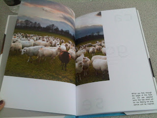
Fashion yearbook proof!!
Few shots of some of the spreads of the yearbook proof
I am very happy with how it has turned out, all of the spreads work together, and the colour has come out strong and as vibrant as possible.
I am very happy with how it has turned out, all of the spreads work together, and the colour has come out strong and as vibrant as possible.
Finalising Roll packaging
This element of the brief wasn't a main aspect, however I wanted to make sure the packaging was understood. Unfortunately I feel the packaging I constructed out of mount board, hasn't turned out neat enough to actually submit. After talking to Fred I am mocking up the packaging on photographs and also creating an artwork that would go on the packaging.
I wanted the design to be quite simple, and also able to be used for the whole year.
I based my design on the template I received when my dc publication arrived. I feel it's appropriate.
I wanted the design to be quite simple, and also able to be used for the whole year.
I based my design on the template I received when my dc publication arrived. I feel it's appropriate.
There will be the roll logo and slogan at the bottom, and then the white box would be a sticker that would be stuck onto the card.
The test in the bottom column specifically states what is in the package, i.e march issue, magazine with poster etc...
bit more decoration on the cover, aiming to infuse a bit of the express/delivery side of it.
Republic pitch
I showed them my idea and they said they liked it and had thought about wanting to use aspects of peoples faces to help communicate the community element of Republic.
I've done a few rough examples of what I had in mind:
I've done a few rough examples of what I had in mind:
I thought about spreading the imagery across the banners that run along the bottom of the building.
Each banner would have an element of a face on it.
I added type, however this could easily be changed.
Also the photos I have used are of celebrities that I used for my Roll brief, so they could be different also.
Wednesday, 23 May 2012
First attempt at boards
FMP boards - prior final crit,
Questions at the moment
- should I include the proposed designs for the other books (bags, ebook and website design)
TO DO -
- include ebook for typographic poetry on boards
- replace screenshots with actual files
- improve roll packaging mock up
- reconsider yearbook boards
Questions at the moment
- should I include the proposed designs for the other books (bags, ebook and website design)
TO DO -
- include ebook for typographic poetry on boards
- replace screenshots with actual files
- improve roll packaging mock up
- reconsider yearbook boards
Tuesday, 22 May 2012
Packaging for the other books,
I prefer how the bags almost exactly relate to the bags, however I have altered a few of the designs to fit nicely with the format of the bag.
----------------------------
for example, the layout of this design has been very slightly adjusted to fit with the paper bag. I don't want any of the design to fall on the other side, as the other side is filled with the full bleed logo. I also want the colours on the side to be solid and undisturbed.
Should the image be smaller on the bag? I feel it looks neater and works better with the books theme, small, black, simple imager. Key word being small.
----------------------------------------------------------------------------------------
vvv
Monday, 21 May 2012
Book brief - in store design.. trying to improve
There is a poster that hangs up next to the area, it's the promotional poster I designed. However, I feel it doesn't suit this context as appropriately. I feel I need to design a simpler one.
Also the two birds clash a bit, taking away the specialness of the main bird on the right.
This poster still has the boldness of the colour and the type etc.. but the bird isn't on it, which I think helps to maintain the significance of the bird on the wall in the shop.
Trying out with a book shelf in the foreground to give the sense of content in the image.
Or I could just crop the image,
This looks a lot better.
---------------
I think it looks dull...
The original images are quite orangey, so I didn't want to layer it with a further yellow fill colour to group it up. I changed the dark blue layer, to a more subtle grey blue,
I think it looks slightly warmer, but also looking more grouped together
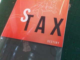
making the Syntax CD covers,
Once I made the simple CD case, I needed to add the acetate. This was a slight problem when it came to folding the acetate, it was quite tough to fold.
The hard bit was adding the letters, I tried to make them look as straight as possible.
the covers as a set
Subscribe to:
Comments (Atom)


