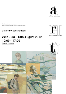
Possible new logo for the exhibition? I prefer the typeface to the old one.
I am struggling with including imagery and the and logo, it doesn't all seem to fit nicely.
I do like the white on the image though.
Larger text. Deliberately too big.
I have tried simplifying the logo to just the A, I prefer it smaller, but want to try and include all her initials.
When thinking the logo was too spread across, I tried having it vertical. Didn't work for me.
more abstract, playing around more with the 'art' letters.
Using a bold colour instead of white and imagery. I do like the simplicity of this one. However I'm torn between using imagery and not.
split colours, bit too much of a bold statement.
Experimenting with having the logo more bunched up, so that the initials are very close, but 'art' reads comfortably. I like this.
I feel the posters are starting to work better, with this new positioning of the logo.
Trying with colours used in her work, and hierarchy of information. However I do want to try and include a split somewhere.
-------------------------------
THESE ARE THE ONES I HAVE DECIDED TO GO WITH:
obvious split, Line down the middle. A nice image that could work throughout the exhibition merchandise.
Invisible line with this one, as the images split represent it here.


