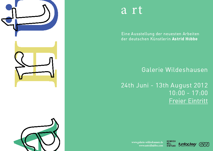
I think I will make a the leading slightly larger on the left hand side, and the type a little smaller. I feel it looks a little cluttered. I have asked around and that is the overall response I have got.

The lines are hard to make even, they are very jagged.

I have tried making these changes, I feel it does seem a little more structured now.
After experimenting with my the mocked up leaflet, I have also moved the type inwards slightly, to allow enough room for the pages to connect in the middle.
-----------------------------------------------------
Now that I have designed the portrait poster I want to also design a landscape poster and a banner:
Landscape poster development: