Tuesday, 7 February 2012

Creative magazine covers,

I.D magazine covers, I like how the layout, typeface changes on each issue but the logo in top right remains the same. They have a strong enough identity to be able to achieve this:


 I am thinking about changing my magazine from Photography to celebrity interview, I want to use photography, possible other media, but photography of celebrities. 

Zigzag magazine(music magazine), DAZED (celebrity)


COLOURS magazine, 

"When Oliviero Toscani developed Colours magazine, he forged a radical, stylish update of the kind of photomontage once published by Arbeiter Illustrierte Zeitung capable of graphically relaying information about complex topics such as immigration, sexuality, consumerism and AIDS"


Little White Lies magazine, (film) through illustration,


Interview magazine, (celebrity specialists) I like the colourful manipulation to these covers, especially the James Franco issue,


Grafik magazine 
"For all graphic designers and lovers of graphic design"

I like the type and layout for these magazines, 


Frieze maagzine, 
I like the versatile approach the magazine has in terms of design style, colour and media used to create the imagery.

"The Year in Review"


Book from the library to help with DP and DC, (for S.O.I)

The Typographic Experiment: Radical Innovation in Contemporary Type Design, T Triggs (2003) London, Thames & Hudson

Typography Now, R Poynor (1998), London, Booth-Clibborn Editions

100 Years Of Magazine Covers, S Taylor (2006), London, Black Dog Publishing

Monday, 6 February 2012

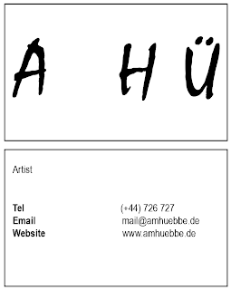
Astrid Hubbe, further development for logo

What do I need to do/consider for this brief? 

Branding/Identity/Promotional
- logo
- business/contact cards
- letterheads
- website
- exhibition (promotional/postcards/posters)


Initials, paint style typeface (Mistral), and in boxes representing her blocky work. 

Colour considerations, after testing out different colour schemes together, I feel these three worked the best. I want to include colour but would it be appropriate to carry across all forms of branding and identity. Colour over a coloured image won't work. 

Black and white variations, I want the separation to be a feature of the painting. This doesn't feature in all of her work but I feel it's something that can be a part of the concept behind the logo/identity design. 

Could I use the letters only as her logo, and then incorporate the boxes as part of the identity for her recent work?

Applying text only logo to initial business cards ideas, 


Sunday, 5 February 2012

Poetry Publication, initial testing,

I thought about relating the poetry's subject to the way it is then written on the page


I need to consider clarity of both the text and the representation of the image

Film poster brief - categorising the brief,

I thought about producing multiple posters for the same film. Approaching the film from different angles and styles.

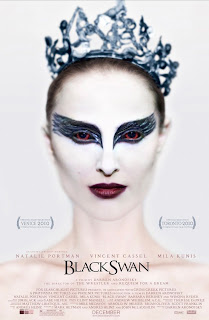
Posters for the film Black Swan, these show the different styles that create the poster, originating from a concept,

alternative/photographic

original poster/character photographic

illustrative

illustrative

illustrative/simple

illustrative

illustrative

Thursday, 2 February 2012

Fashion yearbook - cover concepts to link the two pathways

There are two pathways, Pathway A  (concepts and comunication) and Pathway B (fashion design and realisation).

Ailsa, Elliot and I are the group focusing on Pathway A. Here are some key points, from a slide show fashion tutor Susan sent to us:


-------------------------------
Tomorrow we have a meeting with Susan again to discuss further ideas we have developed about our initial layout ideas and concepts. We have had two meetings since last Friday with Susan, and have discussed how the layout our group came up with for our original pitch for GD yearbook, would be flexible enough to work well with the fashion yearbook. 

For our yearbook, we have thought about having one project shown for each student, however focusing on the elements of it in separate shots. E.g how the branding works on it, the identity and style of the designer, and then a full, overall product shot of the final piece. 

We considered having neutral backgrounds for the photographs of work, as this will draw more attention to fashion itself. We think it's crucial for students to get their work professional photographed (3rd year photography students), we can help them access this facility however this won't be our responsibility. 

Susan mentioned how she wanted the theme of 'looking forward' to be represented somehow, so we thought about having inspiring, positive quotes from the tutors about the group as a whole etc..in the form of breaker spreads throughout the book.
There will also be personal ethos' written my each student, stating their style of working, etc... 

Here is an idea I thought for the cover of the book, that links the two groups together, in a simple way:

 This is the design in a basic form. However if this were the cover for our pathway, it would then connect when laid next to the other book:


*Haven't considered typeface, and/or colour