Thursday, 9 February 2012

Poetry publication, research into typography

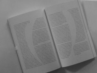
Looking through the book 'Typography Now', I have taken pictures of possible ways I could format the text throughout my publication. 


Combining a more simple layout of text with a vague illustration to help represent

an image with scattered text, this wouldn't work that well with long text as it wouldn't read well
pt size variety, fairly scattered but better flowing 

large type spread across double page

forming a shape through text. I like the idea of this however would try to avoid widows etc...

type manipulation, this is interesting but I don't want to get too involved with typography

slightly manipulated layout

slanted/angled text

combination of layouts, typeface etc...

shaped text

typeface variety

this idea could work with short poetry, highlighting the words through coloured letters

I like this idea, using part text, part rough illustration. However would poetry read well?

Wednesday, 8 February 2012

Poetry Publication, initial testing #2


I am testing out writing the poetry in the way that expresses the message behind it, through breaks and structure of the text. 


sense of security expressed through positioning on the page 

Expressed through specific typefaces?
I need to think of a concept that can run through the publication that personalises each poem.

Tuesday, 7 February 2012

Photography mag, developing layout concept/design


Photographers following the photograph?

Type manipulation/decide


The 'O' in cover focusing on an element of the photograph?


Photography magazine, image/photographer sourcing

Possibilities,


William C. Beall 1958


Charles Clyde Ebbets 1932

Leona Gorge

I got a book from the library, PhotoWisdom

I am finding photographers I think will be appropriate for my covers, 


Adam Broomberg & Oliver Chanarin


Adam Fuss


Albert Watson


Andrew Zuckerman


David Moore


Elliott Erwitt


Ernesto Bazan


Poetry publication, research into typography

Nick Bell, typography


These were a series of screen-based animations for an installation at the British Nuclear Fuel visitors centre. I like how they have been created through subtle manipulations to the existing typeface to communicate the message. 

-------------------------
A catalogue, Literary Objects: Flaubert. The Designers aimed to replicate Flaubert's writing style by creating a typographic environment, 

--------------------------------------

Under the Visual Poetry chapter in "The Typographic Experiment", 
Avital Ronell's book 'The Telephone Book', creating electric speech through type and layout,